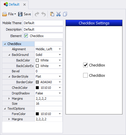
Themes: CheckBox

This screen sets the look and feel for the CheckBox control which enables the user to choose one or more items from a list.
CheckBox: Alignment property shifts the checkbox's position relative to the label. The default is Middle, Left.
CheckBox: Background sets the background color of the checkbox.
CheckBox: Bevel sets the curvature of the checkbox edges where 0 is the default (no bevel) and a positive number increases the roundness of the corners. The ratio changes relative to the size of the checkbox.
CheckBox: CheckColor sets the color of the checkmark.
CheckBox: DropShadow will cast a shadow behind the checkbox if set to True; False disables this feature.
CheckBox: Margin sets the CheckBox's top, left, right and bottom margins. Note this can affect the spacing between the Caption's margins (described above.)
CheckBox: Size sets the checkbox size in pixels.
CheckBox: TextOptions sets the color of the labels and label margins.